Date: 01/10/23
first post!
Here are some websites I finds pretty
 inspo1
I am really drawn to the color palette and the way they display their data.
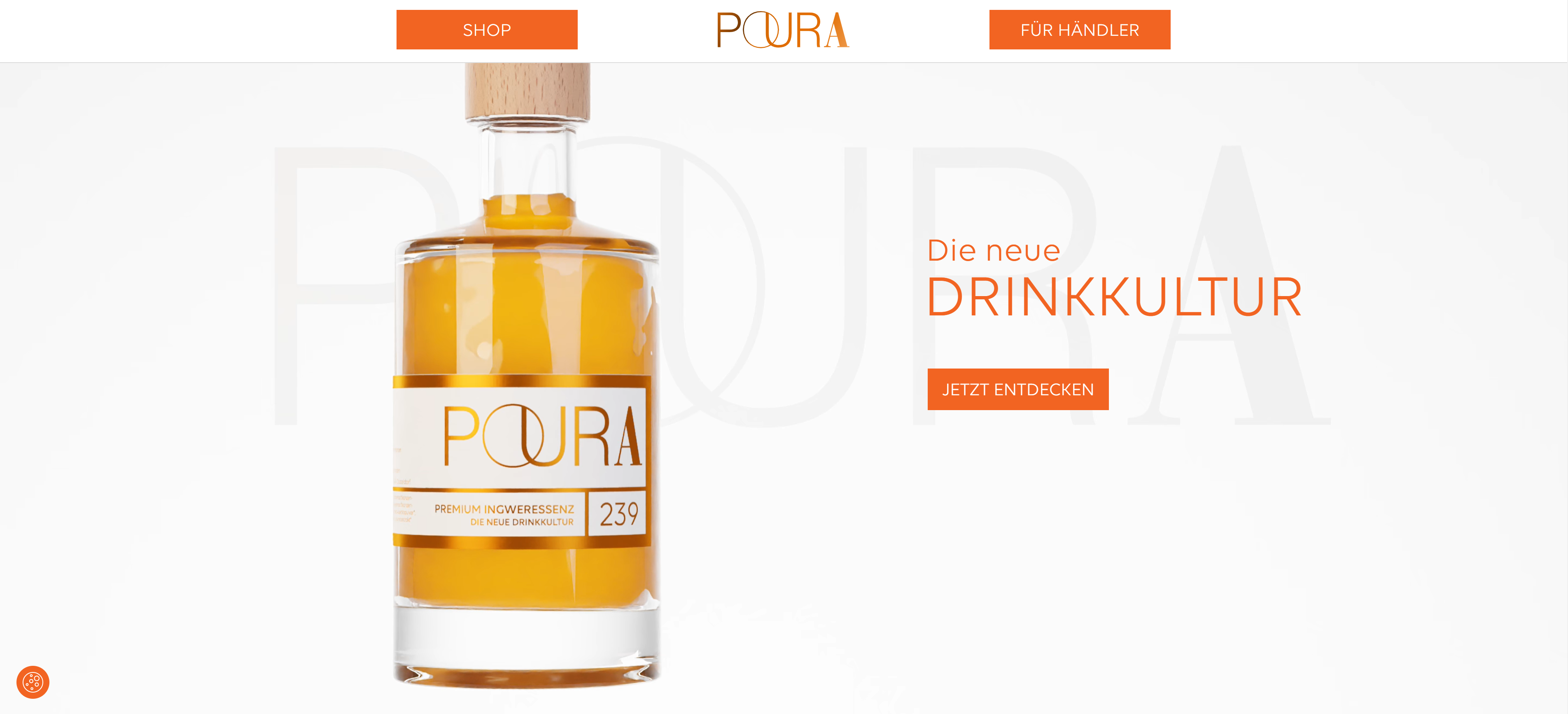 inspo2
I am really drawn to the front page and they way they make the bottle interactive throughout their website.
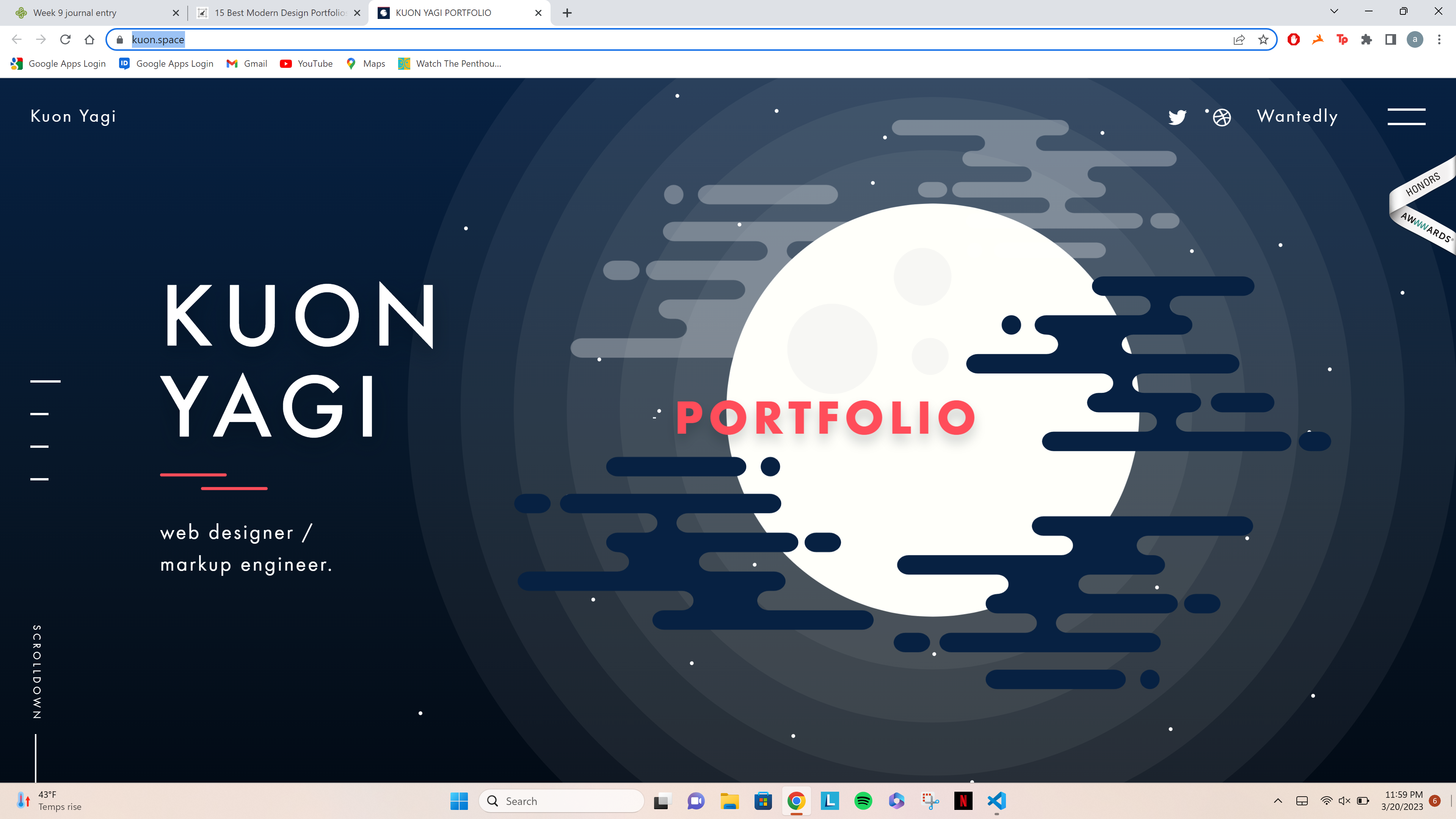
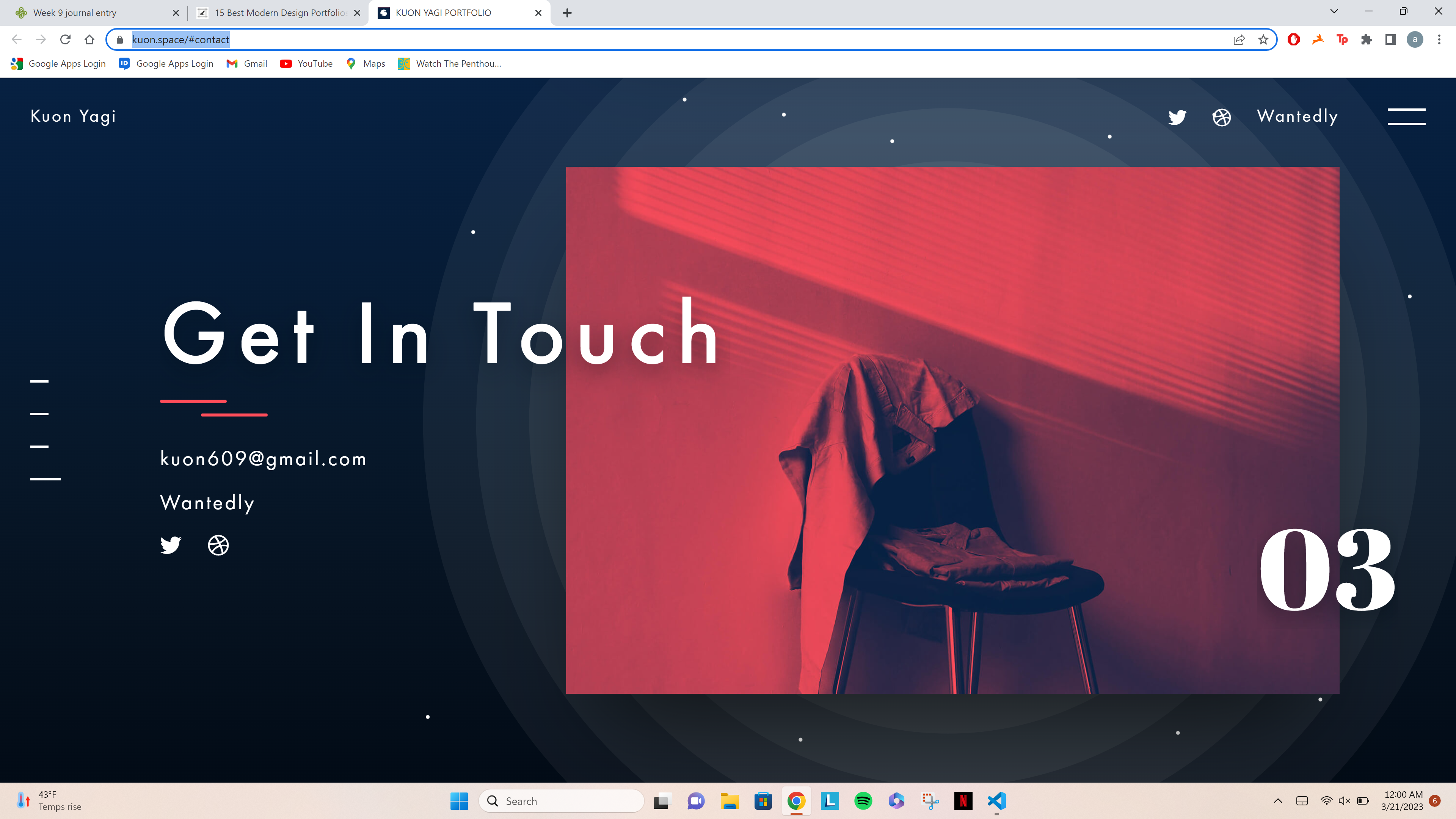
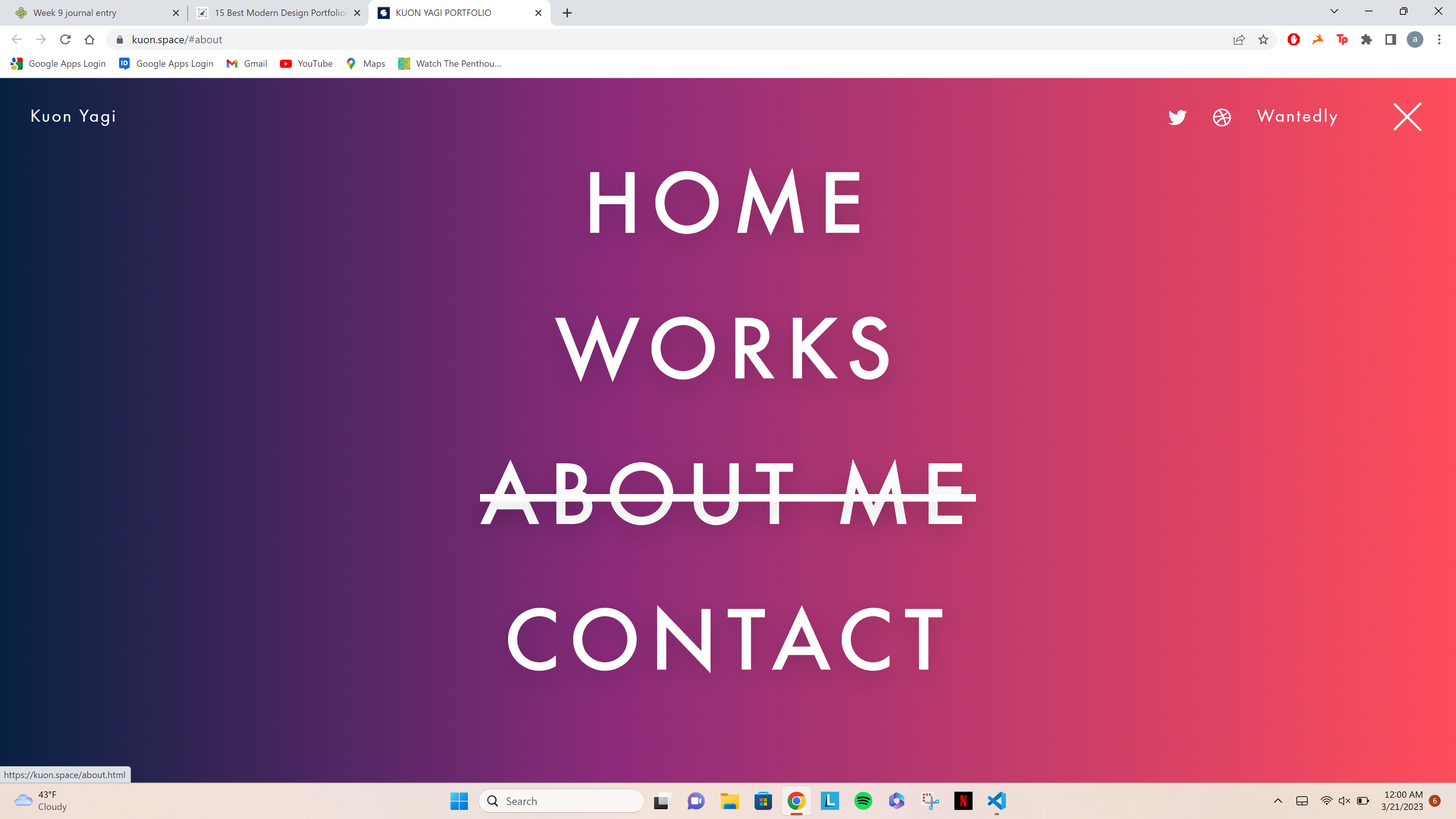
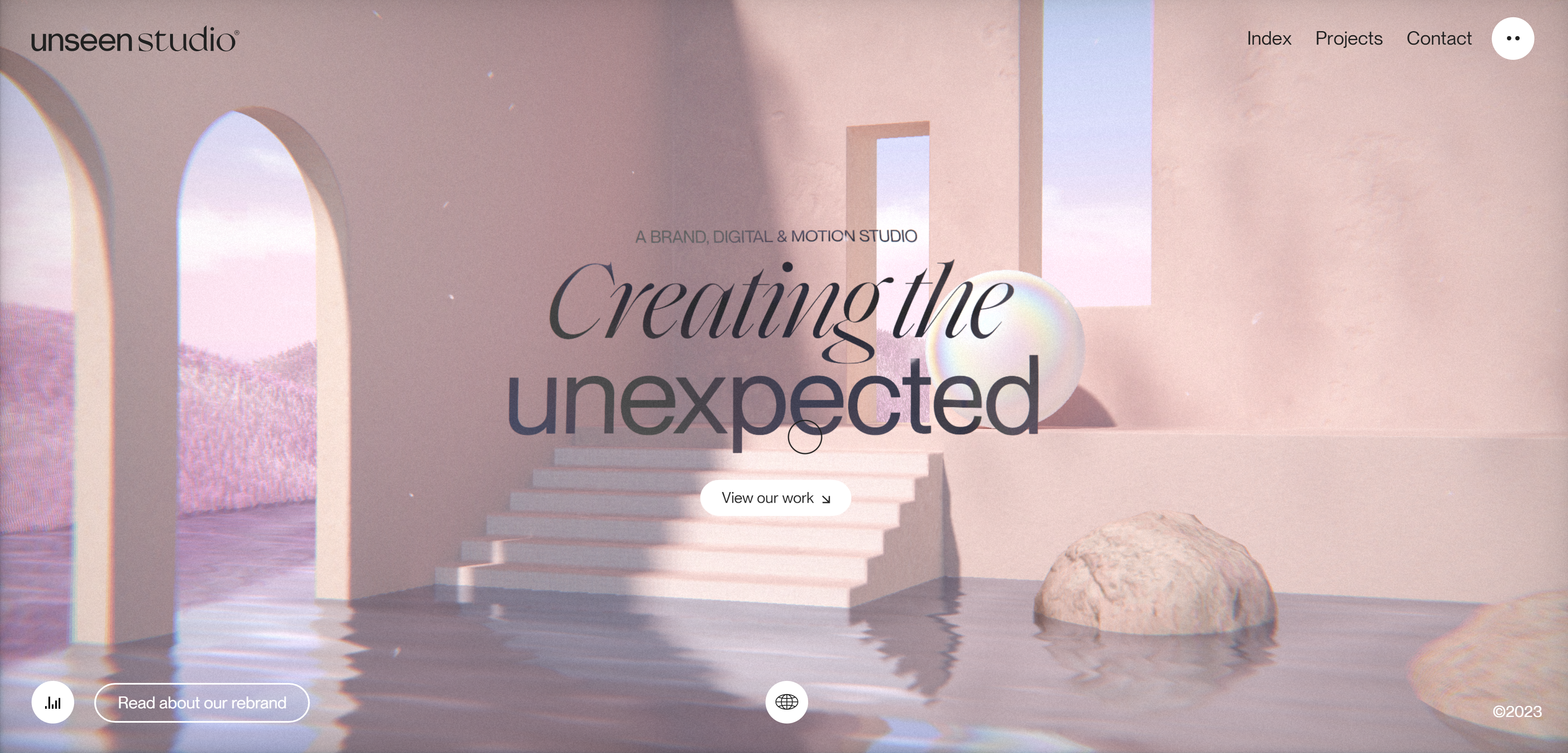 inspo 3
inspo3
inspo 3
inspo3
The use of space and 3D art is really well done here. The color palette is super pretty and eye catching.
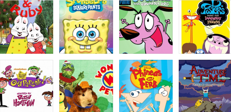
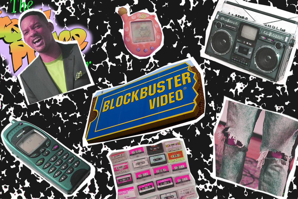 nostalgic-video-games-for-gen-z
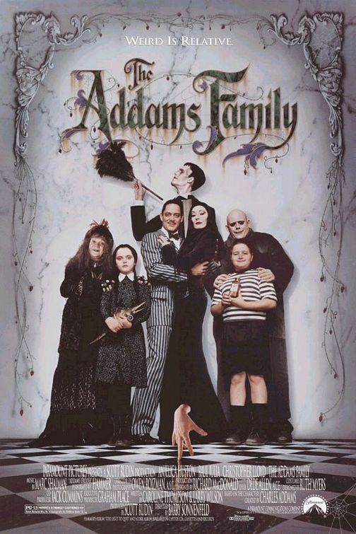
Growing up in the early to late 20's I had a lot of memeories that stuck with me to this day. Growing up, I really loved playing videos as well as disney channel and Nickelodeon. I would always watch theses shows before catching the bus in the morning or stay up waiting for a new episode. During this time, I was also obessed with anything mario and playing the Wii. It brings back memories when I would have sleepovers with my cousins and our favortie thing was staying up all night playing the wii.
When I go onto this website, the first that comes to my mind is where is the Navigation bar. I think I would first start off with a Navigation bar to help organize the website. I also like the use of picture in this website, but I think it could be done in a more animated illustrated way. I was thinking some kind of pop animation with the pictures and some fun illustated animation to bring some life into the website. I also think this website would be fun to use a scroll down hompage showing the menu.
Just teaI wouldn't say this website is horrible or done super poorly, but I do think it can be organized in a better way. For example, as I scroll down each section would pop up. I would also change the type into something that has more character since the logo uses a lot of curves. I would also add the address to the end of the homepage along with a map of their location.
I was really drawn to the homepage and how interactive this site is. It also flows very smoothly and has barely any glitch. The illustrations are really cool as well and gives off midnight mascarade vibes. It's also really easy to foloow and easy to read ehich is really thoughtful for those who are hard of read.